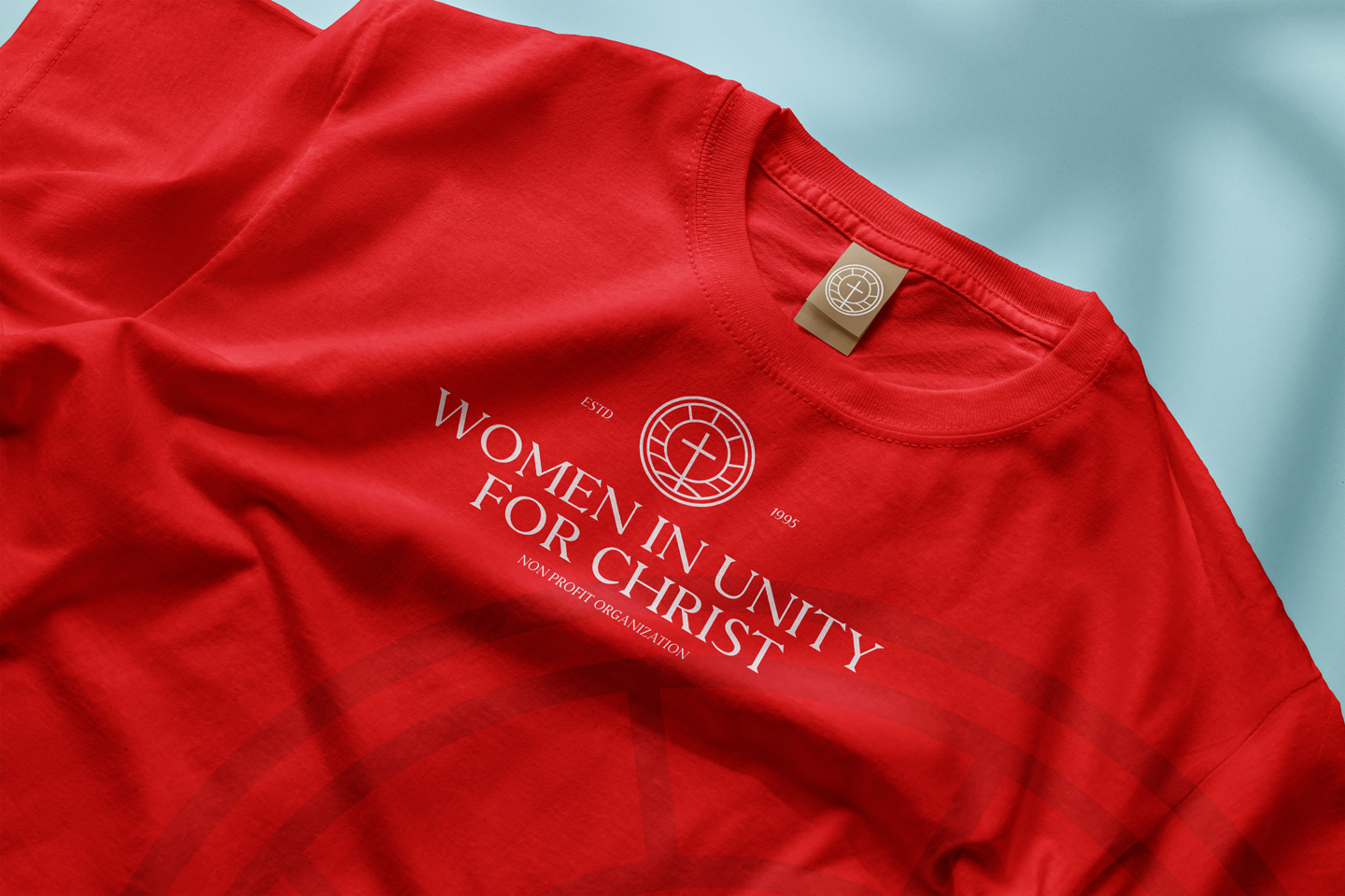
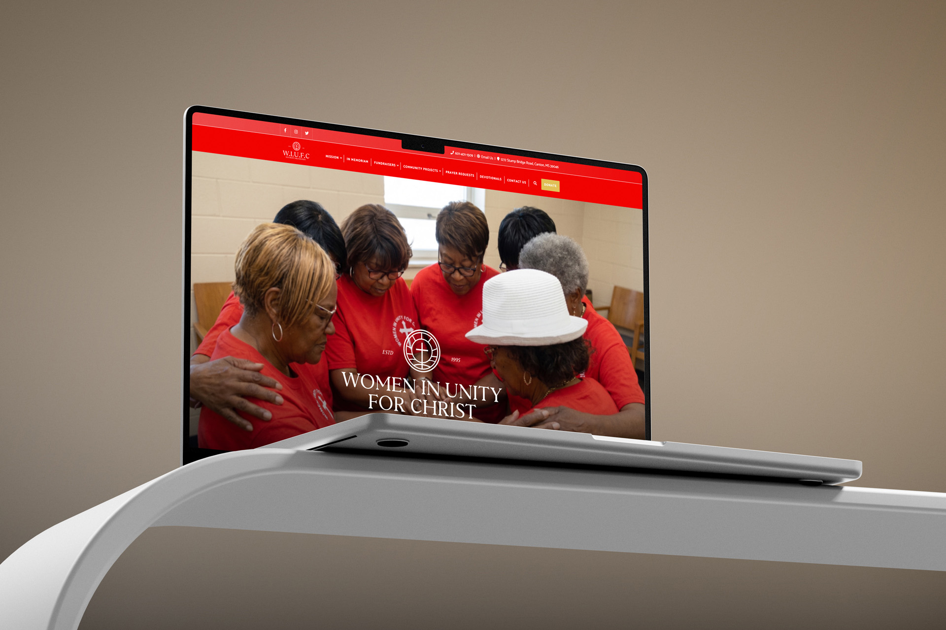
Women Inunity For Christ
Translating Mission into Design
Founded on a mission of Christian service, Women in Unity for Christ brings people together to make a meaningful difference in their community. The design challenge was to reflect that mission through clear, cohesive visual communication that honors the organization's faith-centered purpose and community impact.
A creative project inspired by Women in Unity for Christ, a Mississippi-based nonprofit dedicated to strengthening communities through faith, youth development, women's empowerment, and outreach to those in need.
Services Provided
Branding
Logo Design
Nonprofit Communications
Faith. Fellowship. Community.
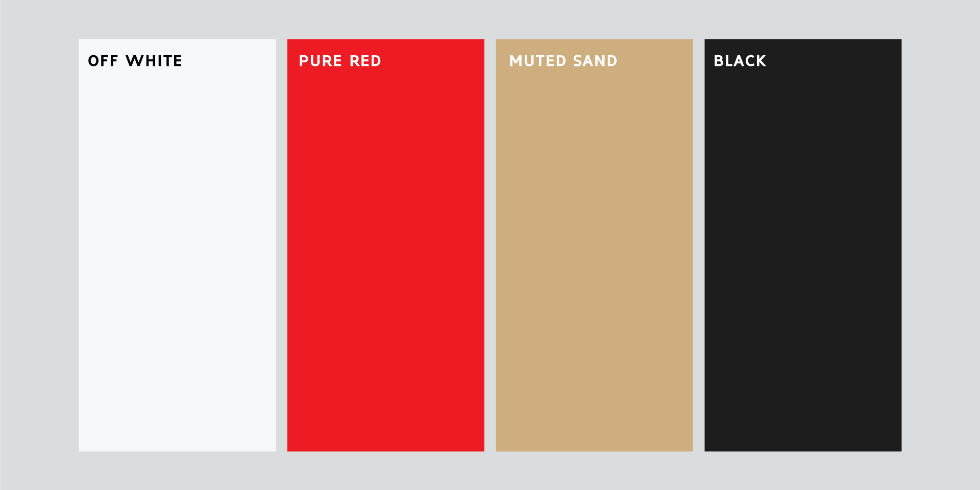
The Creative Direction
The visual direction centers on the values at the heart of the organization: unity, service, and spiritual growth. The goal is to create a recognizable presentation that feels welcoming and purposeful while communicating the organization's commitment to uplifting individuals and families.
Each design decision begins with understanding the organization's purpose and the people it serves. Through thoughtful composition, visual hierarchy, and consistent presentation, the creative approach aims to communicate the mission clearly across organizational and promotional materials.
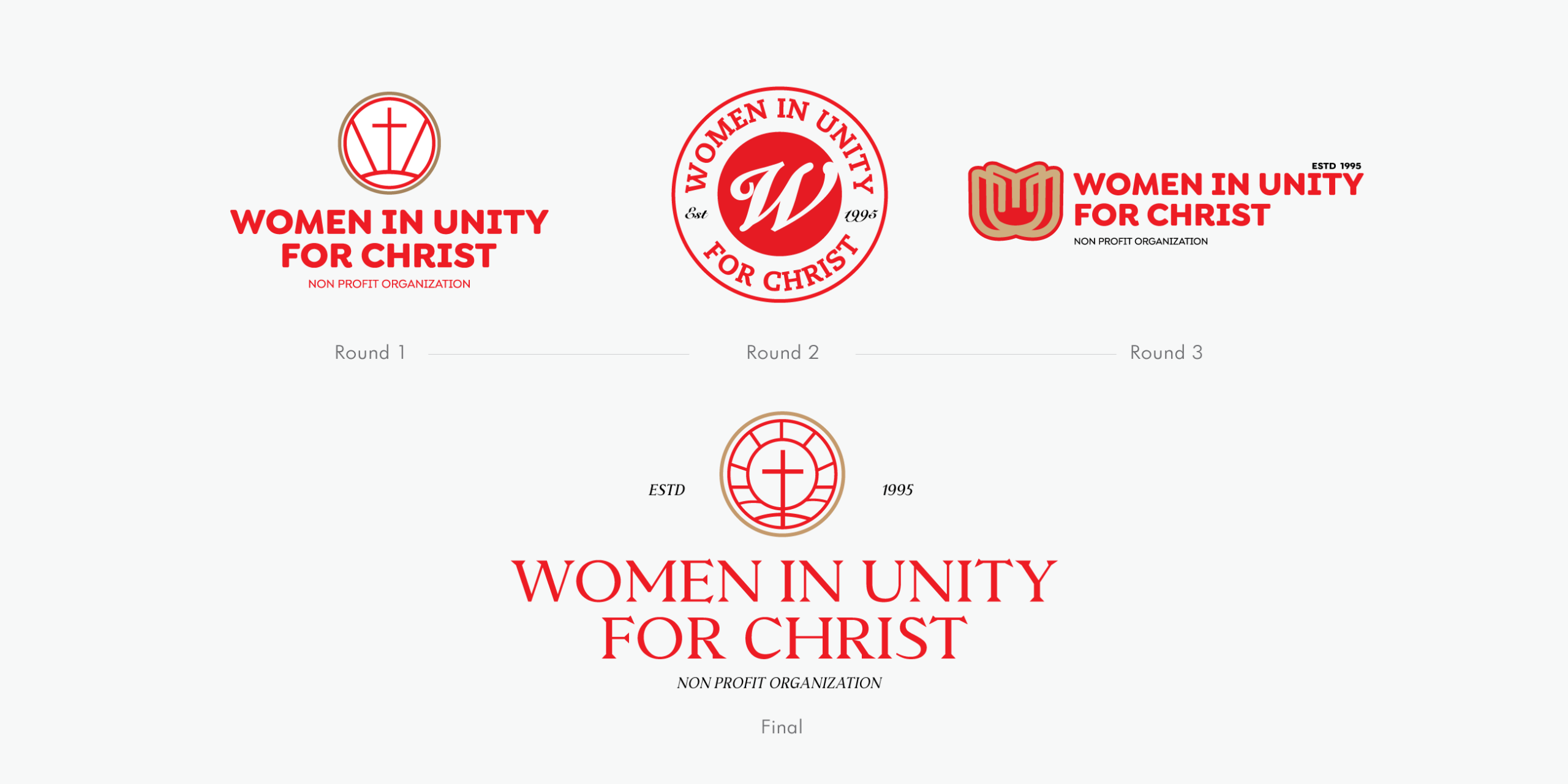
Logo
The logo serves as a visual representation of the organization's commitment to faith, fellowship, and collective action. Its design brings the identity into focus, creating a recognizable mark that reflects the connection between spiritual values and community service.
Designed with versatility in mind, the identity can extend across outreach materials, events, and digital platforms while maintaining a consistent and meaningful presence.

Community Impact
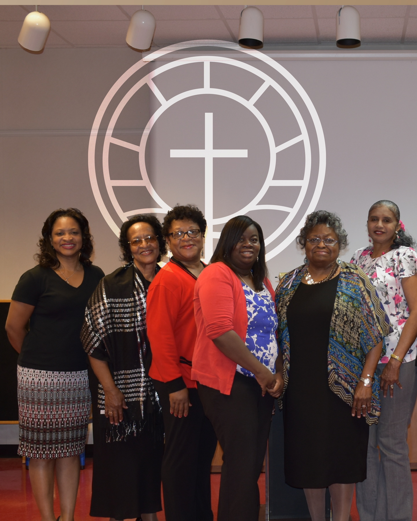
Women in Unity for Christ's work extends beyond its identity, supporting youth education, scholarships, women's development, and outreach to vulnerable members of the community. The organization's vision for a Community Life Center further reflects its commitment to creating opportunities, resources, and support for local families.
Rather than relying on unnecessary visual complexity, the design embraces a direct approach that reflects the practical nature of the industry and gives the brand room to grow.