Katie Kakes
A Sweet Identity with Personality
A playful brand identity created to capture the warmth, charm, and homemade appeal of Katie Kakes. The design brings personality to the brand while establishing a memorable visual presence for a business built around sweet treats.
The objective was to develop a distinctive logo that felt approachable, recognizable, and true to the character of a baked-goods brand. The identity needed to stand out while remaining versatile enough for packaging, labels, promotional materials, and digital use.
Services Provided
Branding
Logo Design
French Lawn Care services need direction focused on simplicity, versatility, and instant recognition.
Logo
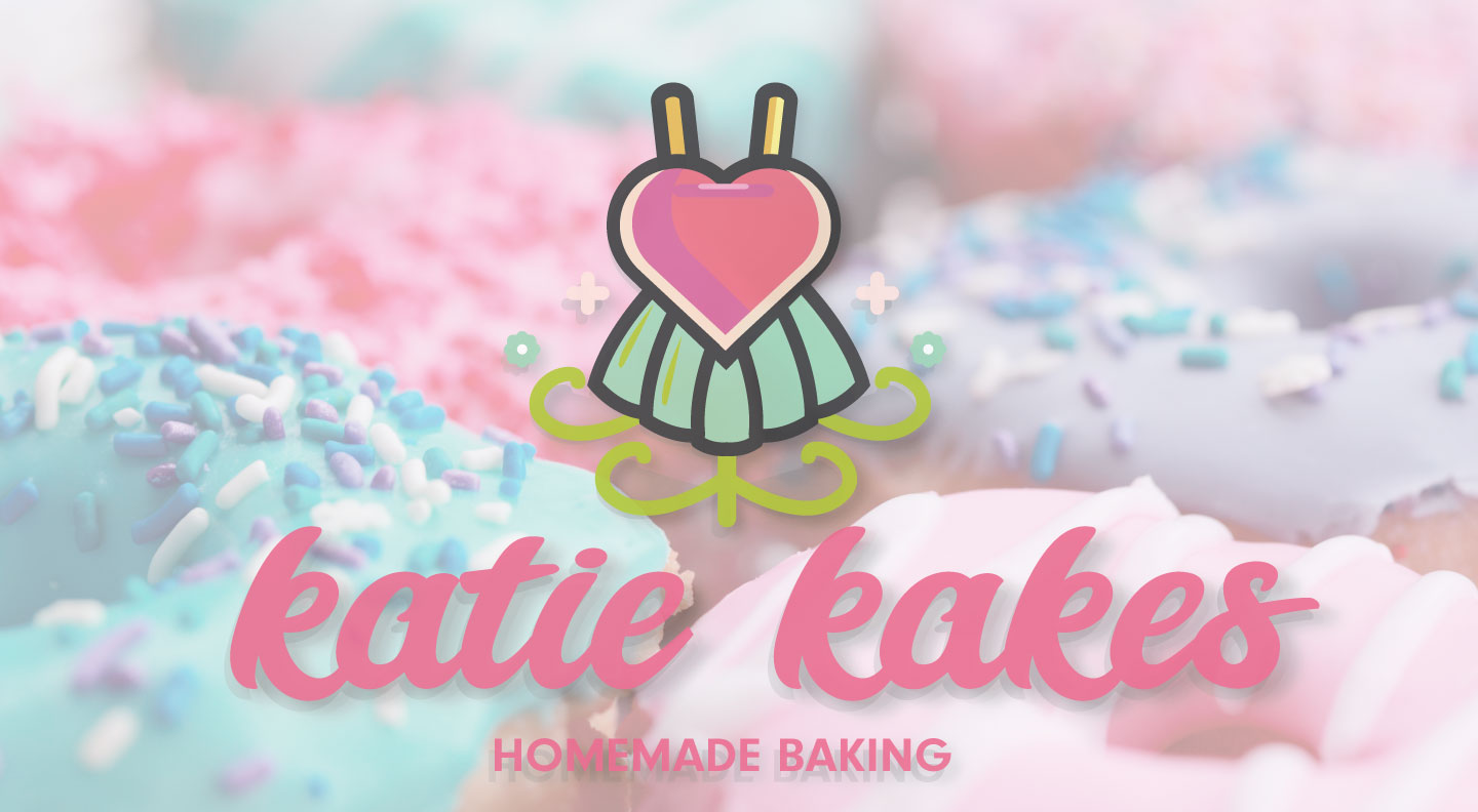
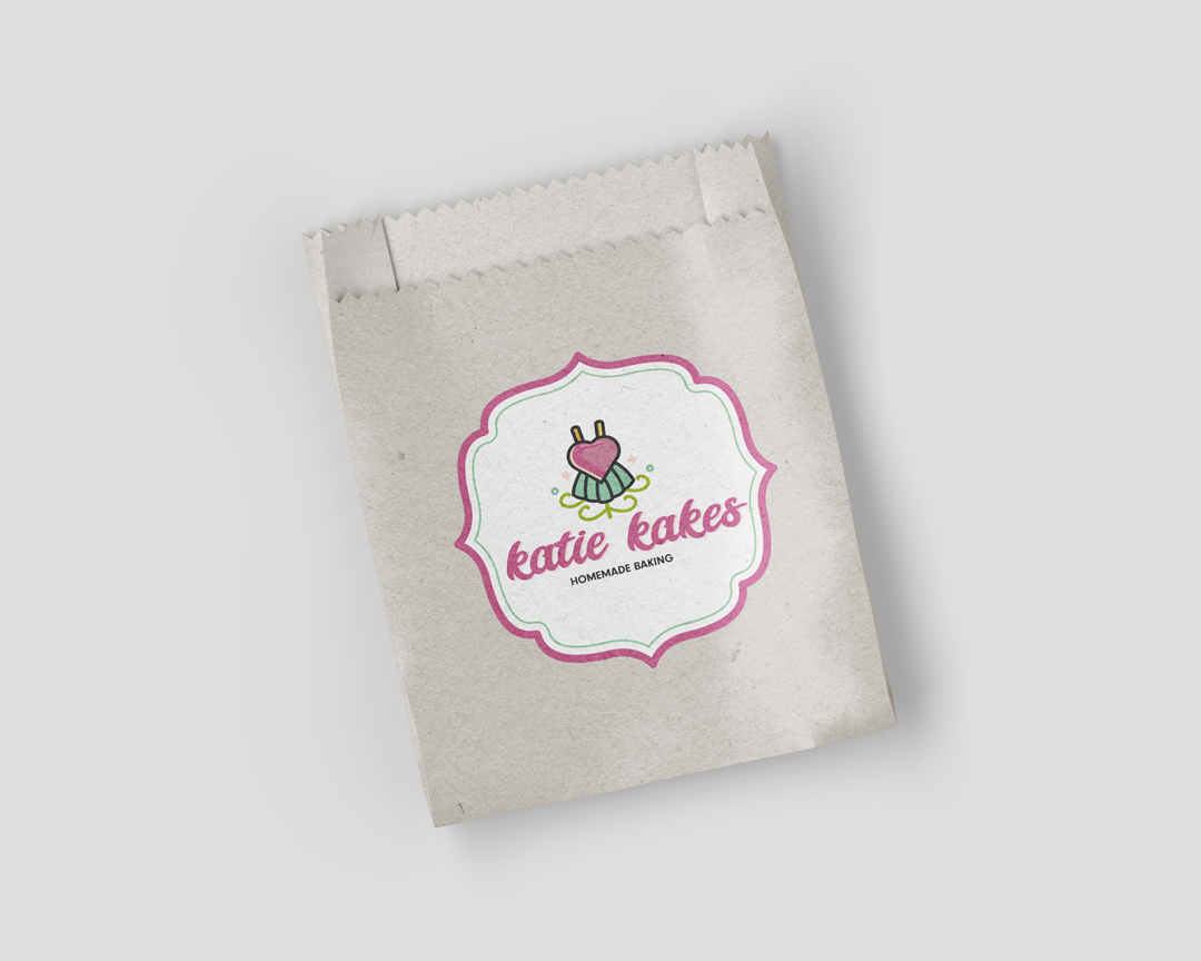
The logo was designed to give the brand its own personality, translating the appeal of homemade treats into a cohesive visual identity. Its overall composition prioritizes recognition and versatility, allowing the design to carry across different applications without losing its character.
The creative direction balances playful character with a clear, recognizable presentation. The logo serves as the centerpiece of the identity, giving Katie Kakes a visual signature that feels inviting and memorable.
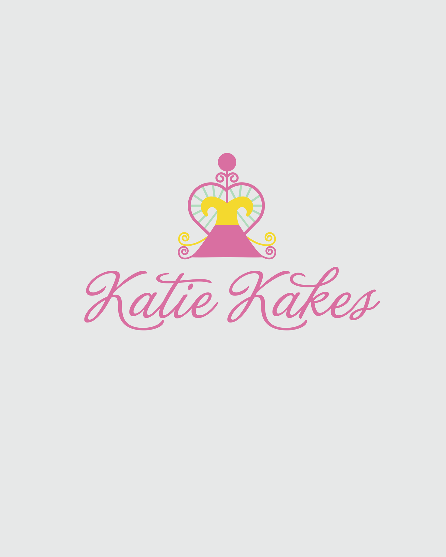
Before
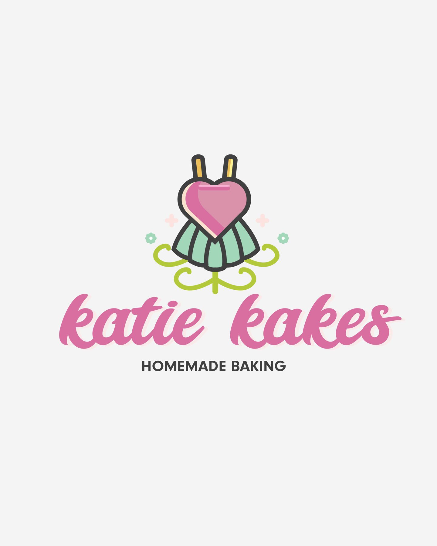
After
Visual Identity
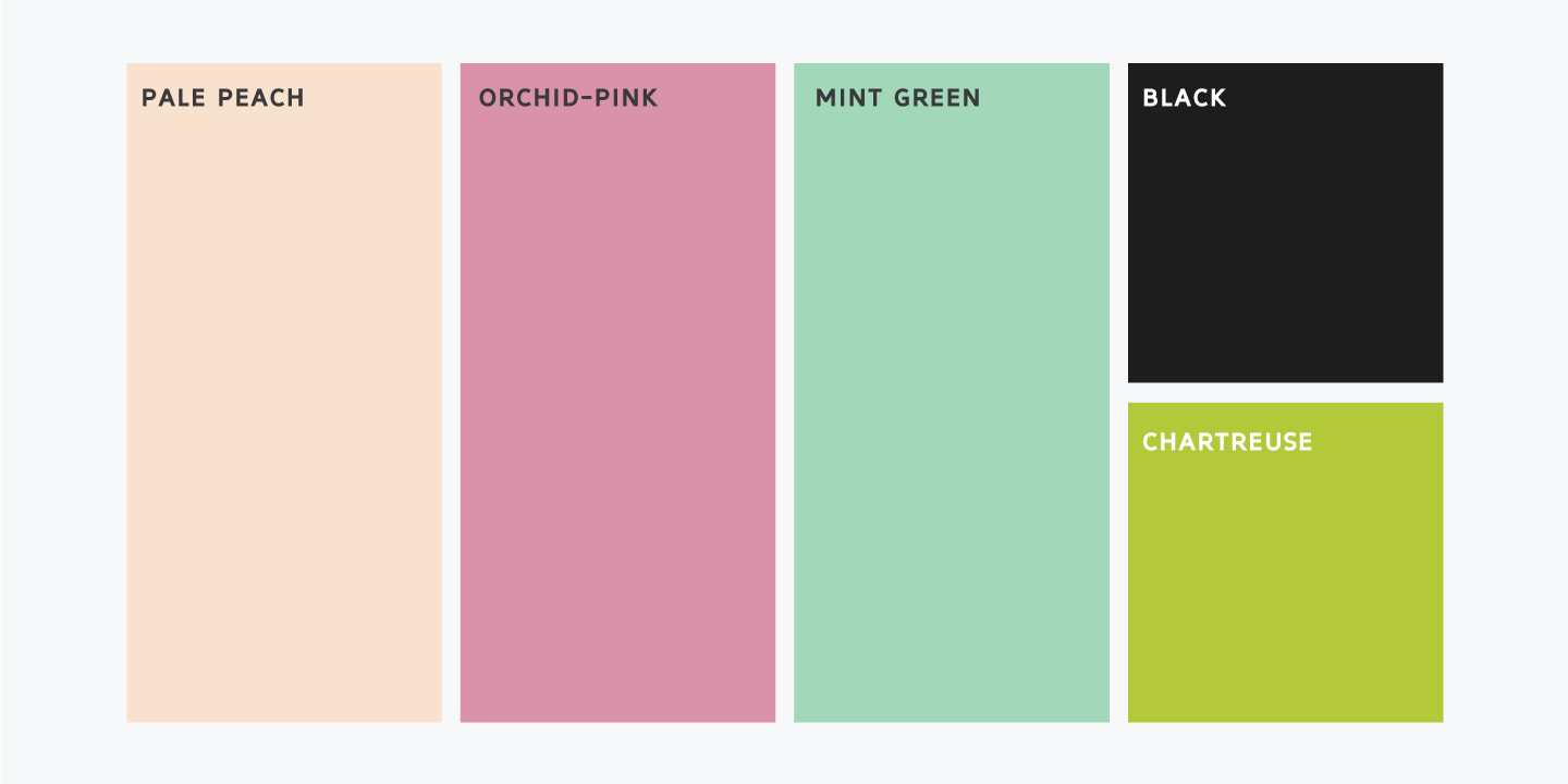
The identity can extend across packaging, stickers, business cards, and social media graphics, helping connect the product presentation with the personality behind the brand.
Rather than relying on unnecessary visual complexity, the design embraces a direct approach that reflects the practical nature of the industry and gives the brand room to grow.
Rather than relying on unnecessary visual complexity, the design embraces a direct approach that reflects the practical nature of the industry and gives the brand room to grow.
Packaging
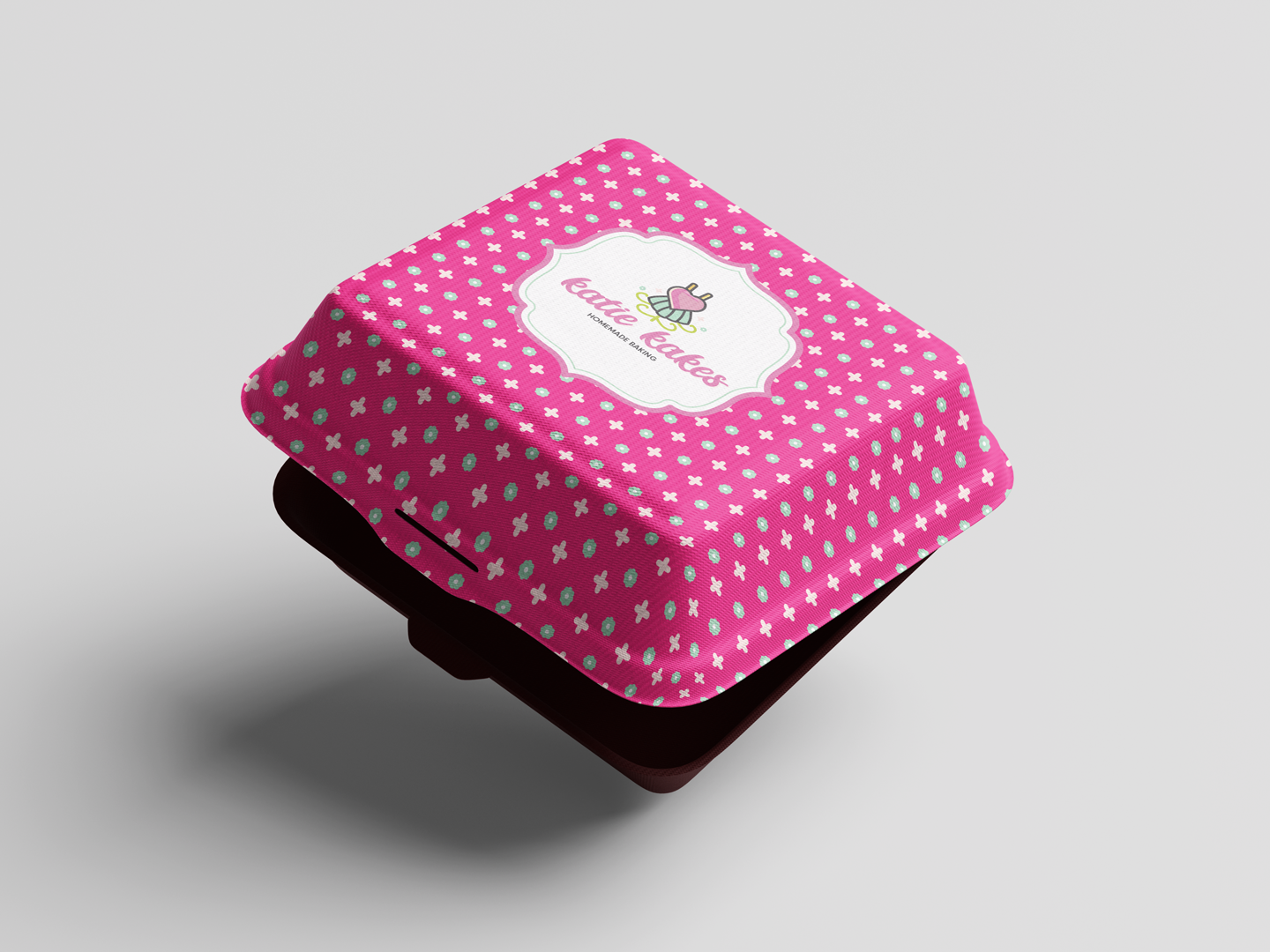
The custom box design extends the Katie Kakes identity beyond the logo, creating a cohesive presentation that feels polished, inviting, and instantly recognizable. Thoughtful branding transforms everyday packaging into part of the customer experience.
Rather than relying on unnecessary visual complexity, the design embraces a direct approach that reflects the practical nature of the industry and gives the brand room to grow.
Branded Wax Paper
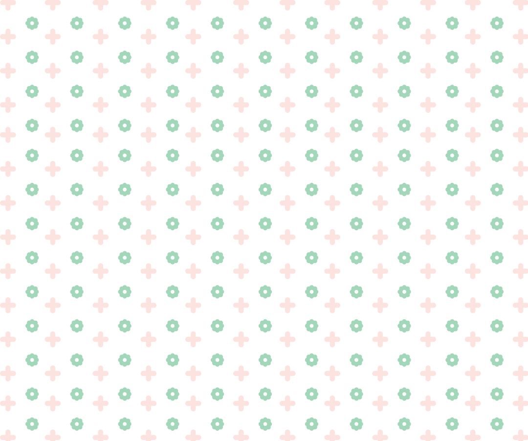
A custom repeating pattern carries the brand into every layer of the packaging. Designed to complement the box, the wax paper adds a playful finishing touch while creating a consistent, carefully considered presentation from the outside in.
Rather than relying on unnecessary visual complexity, the design embraces a direct approach that reflects the practical nature of the industry and gives the brand room to grow.