Chaos Booked Photography Logo
Every element has a purpose. Every detail tells a story.
The goal was to bring the moon, an open book, and flowing vines together in a single logo while keeping photography at the heart of the identity. Each element carries its own meaning, but the challenge was making them feel like one intentional design rather than separate illustrations.
The challenge was to create a distinctive identity for a service-based business in a competitive local market. The branding needed to be approachable and memorable while maintaining the strength and credibility associated with professional lawn care and property maintenance.
Services Provided
Icon
Logo & Identity Design
Visual Concept Development
Typography
A thoughtful blend of nature, storytelling, and photography—unified through a distinctive visual identity.
The Design Process
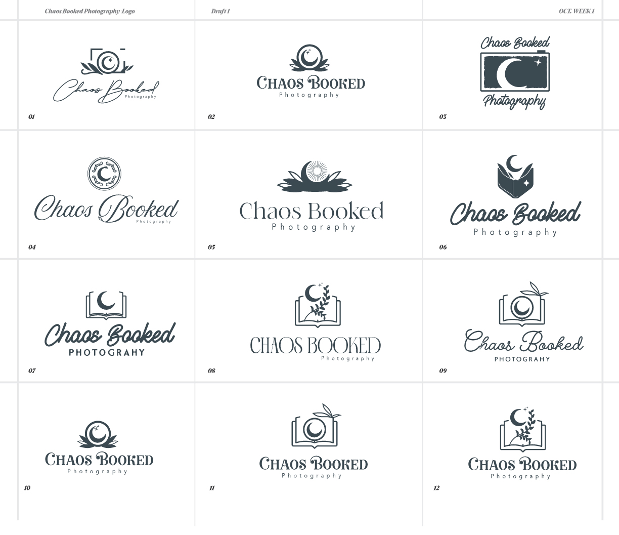
The process began by exploring how the requested elements could share a unified silhouette. The moon introduces a sense of atmosphere and wonder, the book represents stories and memories, and the vines bring a natural, organic quality to the mark. Together, these elements create a distinctive symbol designed to reflect the personality behind the photography brand.
Typography was selected to complement the illustrative detail without competing with it. The wordmark establishes the brand name, while supporting typography provides a consistent system for use across different applications. The goal was to balance personality with readability so the identity remains recognizable at different sizes.
Color Palette
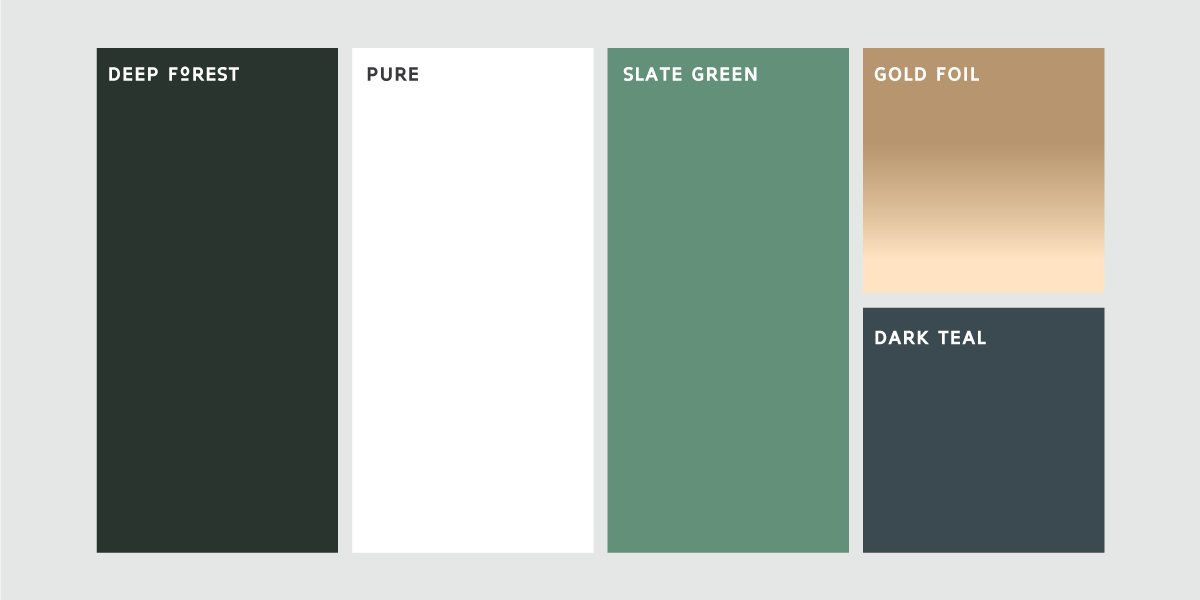
The color direction supports the character of the illustration, helping the organic details and central symbol feel cohesive. The palette was considered as part of the overall identity, with flexibility for use on different backgrounds and in simplified applications.
Rather than relying on unnecessary visual complexity, the design embraces a direct approach that reflects the practical nature of the industry and gives the brand room to grow.
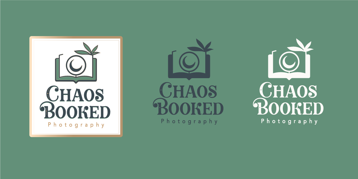
Icon System & Logo Variations
The identity was designed to function as both a complete logo and a standalone symbol. The combined version brings the icon and typography together, while the icon can work independently where space is limited or a more compact brand mark is needed. This flexible system helps maintain recognition across different placements without relying on one fixed arrangement.
Rather than relying on unnecessary visual complexity, the design embraces a direct approach that reflects the practical nature of the industry and gives the brand room to grow.