Cotton Psychological Services
Project Overview
Cotton Psychological Services needed a visual identity that reflected the personal nature of its work while establishing a professional, recognizable presence. The goal was to create a brand that felt approachable and trustworthy, with a cohesive visual language that could carry across marketing materials and everyday client communications.
The project brought together brand strategy, logo design, illustration, color theory, typography, and print design to create a unified identity from the ground up.
Services Provided
Branding
Logo Design
A thoughtful brand identity built around connection, care, and clarity.
The Challenge
In a field where trust and personal connection matter, a brand needs to communicate more than professionalism alone. It should feel welcoming without losing credibility, distinctive without becoming distracting, and consistent across every interaction.
The challenge was to translate those qualities into a visual system that represented Cotton Psychological Services while giving the organization a clear, versatile foundation for communicating with its audience.
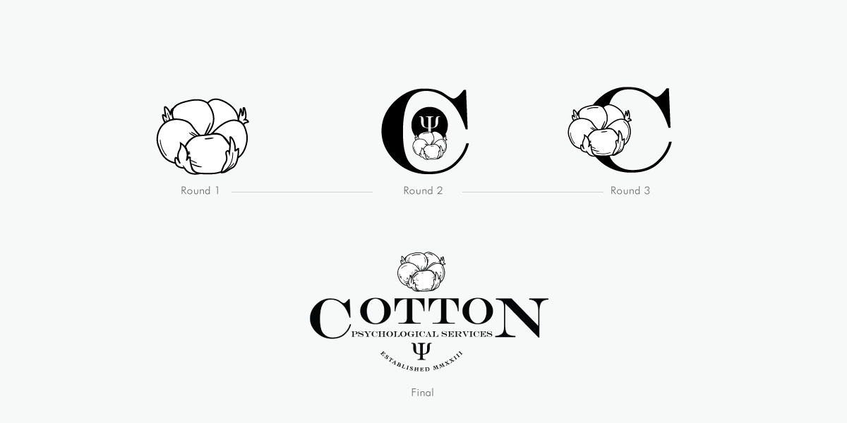
Logo Design
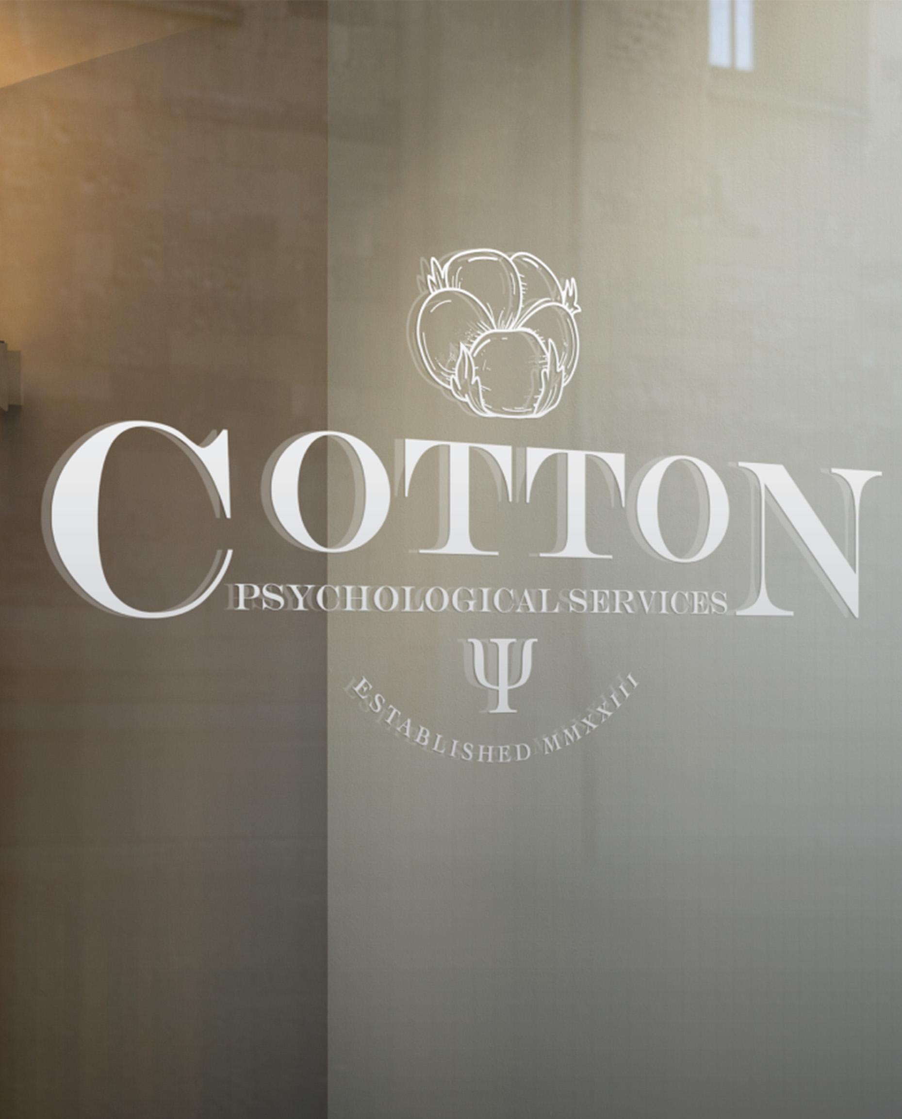
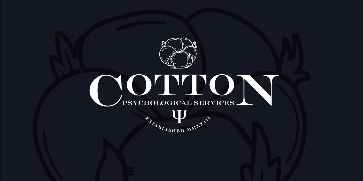
The logo served as the foundation for the identity. Its design focused on creating a distinctive, balanced mark that could represent the organization clearly while remaining practical across different sizes and applications.
Rather than relying on unnecessary visual complexity, the design embraces a direct approach that reflects the practical nature of the industry and gives the brand room to grow.
Attention was given to proportion, spacing, typography, and visual recognition. The goal was to create an identity that felt considered and professional, whether viewed on a printed brochure, a small graphic, or a larger branded application.
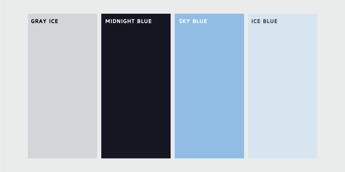
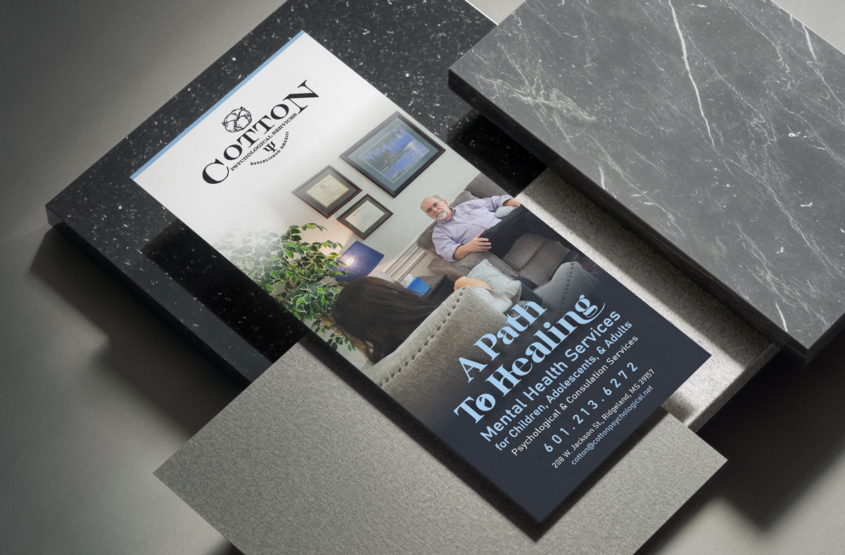
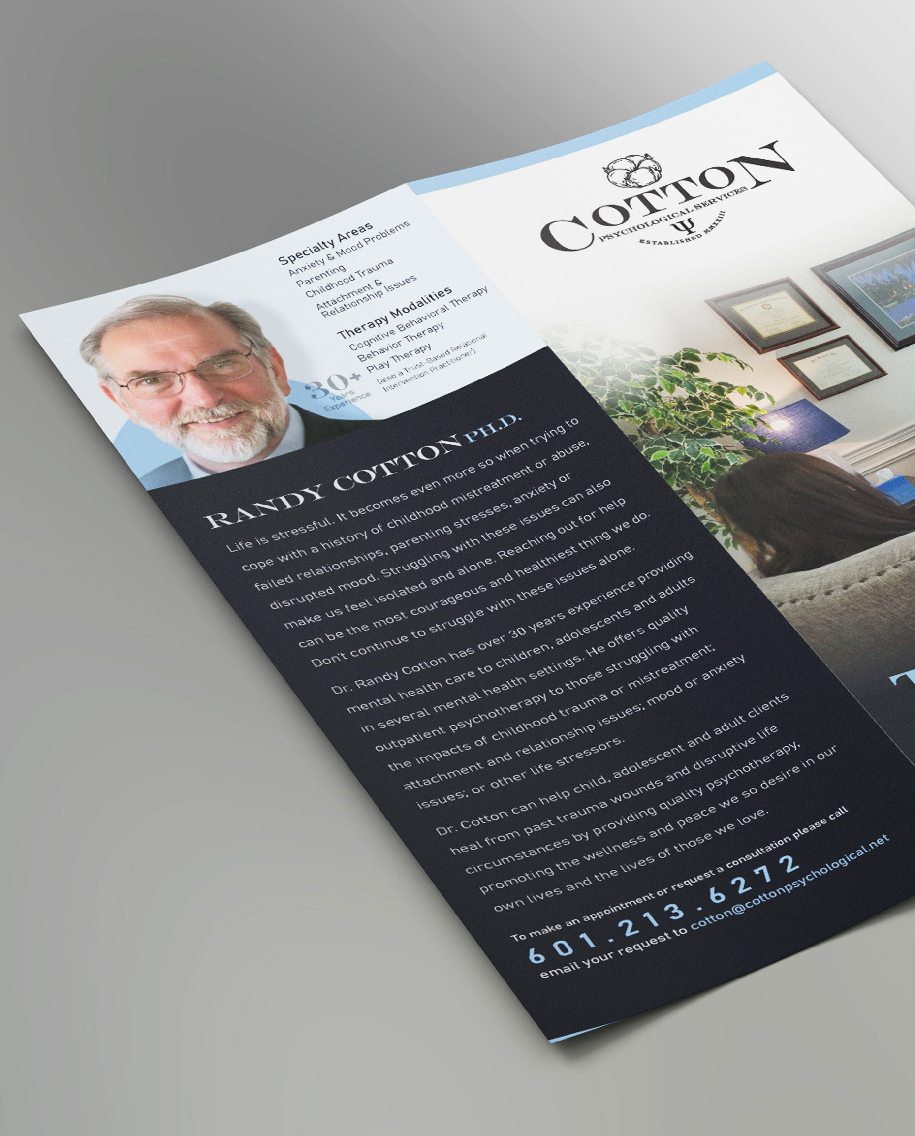
Marketing Materials, Color Theory, & Typography
Color and typography played an important role in establishing the brand's tone. The palette was considered for its emotional associations, visual balance, contrast, and ability to remain effective across both digital and print applications.
Typography was selected and organized to create a clear hierarchy between headlines, supporting information, and body copy. Readability, spacing, and consistency guided the layout decisions, ensuring that the visual presentation supported the message rather than overwhelming it.
Rather than relying on unnecessary visual complexity, the design embraces a direct approach that reflects the practical nature of the industry and gives the brand room to grow.
Layout, imagery, typography, and color were brought together to present information in a structured, accessible format.
Each piece was designed to balance visual appeal with practical communication, making the materials feel like a natural extension of the brand. Consistent styling across the collateral helped reinforce recognition and create a more unified presentation.